Trendlines Explained: How to Draw Them and Why They Work
fomoMay 20, 2026

Every chart tells a story, and trendlines are how you read the plot. Whether you're watching Bitcoin rip on a 5-minute chart or tracking a memecoin's weekly structure, knowing how to draw and interpret trendlines is one of the most practical skills in technical analysis.
This guide breaks down what trendlines actually are, how to draw them the right way, and the setups they create — with clear chart examples for every concept.
TL;DR
Trendlines are diagonal lines drawn on price charts that connect swing highs or swing lows to show trend direction. They act as dynamic support and resistance. You need at least two points to draw one and three touches to confirm it. This guide covers uptrend lines, downtrend lines, breakouts, bounces, and the most common mistakes traders make.
What Is a Trendline?
A trendline is a straight line drawn on a price chart that connects two or more significant price points — either swing highs or swing lows. It visually represents the direction and momentum of a trend.
Think of it as the diagonal version of horizontal support and resistance. While a horizontal level marks a fixed price, a trendline moves with the market, rising or falling over time as the trend evolves.
Trendlines serve three main purposes: they identify trend direction (up, down, or sideways), they highlight dynamic support and resistance zones, and they help traders spot potential entries and exits when price interacts with the line.
The Two Core Types
| Uptrend Line | Downtrend Line | |
|---|---|---|
| Connects | Higher swing lows | Lower swing highs |
| Acts as | Dynamic support | Dynamic resistance |
| Signals | Buyers stepping in at rising levels | Sellers pushing price lower over time |
| Drawn along | The bottom of price action | The top of price action |
📊 Chart: Uptrend Line
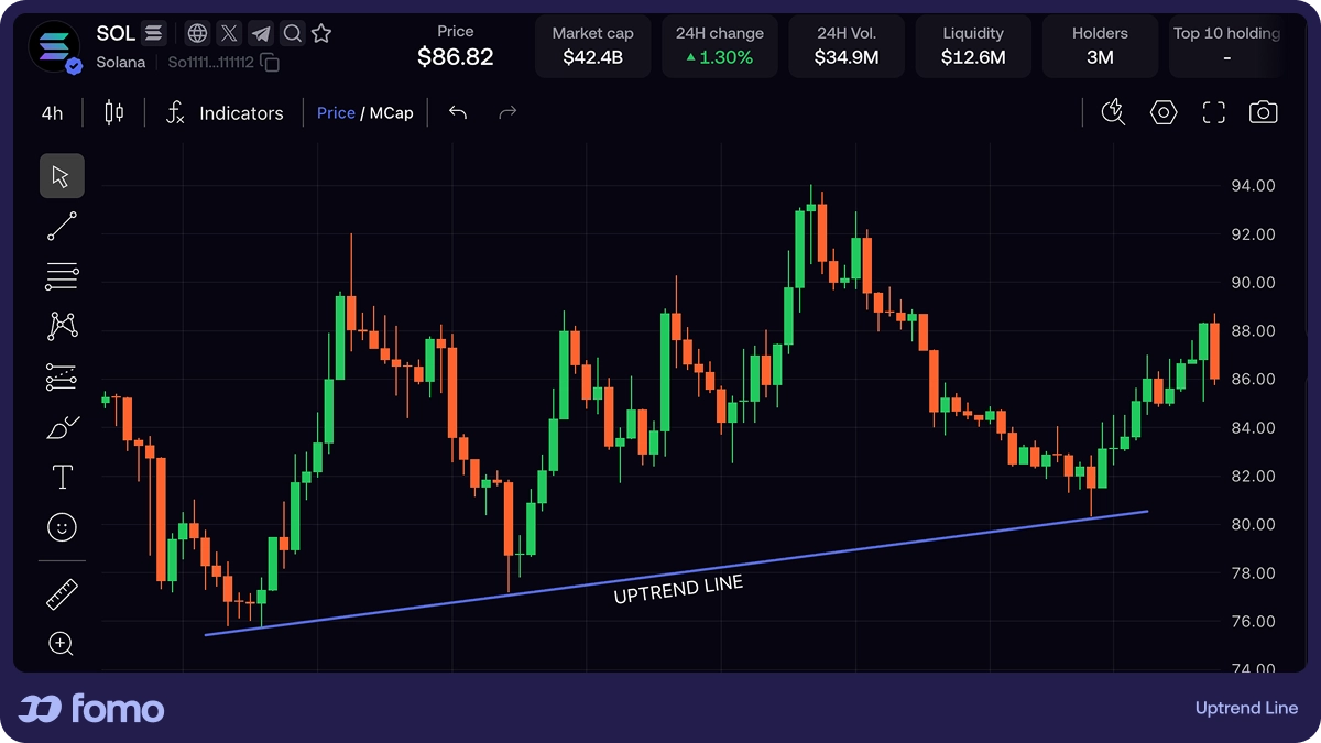
An uptrend line connects a series of higher lows. Each time price pulls back to this line and bounces, it reinforces the idea that buyers are present at that level. The more times the line holds, the more significant it becomes.
📊 Chart: Downtrend Line

A downtrend line connects lower highs. Price rallying up to this line and getting rejected confirms that sellers are still in control. It acts as a ceiling that price struggles to break through.
How to Draw a Trendline (Step by Step)
1. Identify the trend. Zoom out. Is price making higher lows (uptrend) or lower highs (downtrend)? If neither is obvious, a trendline may not be the right tool yet.
2. Find two clear swing points. For an uptrend, locate two distinct swing lows. For a downtrend, find two swing highs. These should be obvious turning points — not minor noise.
3. Connect them with a straight line. Use your charting platform's line tool. Extend the line to the right so you can see where price may interact with it next.
4. Wait for a third touch. Two points create a line. Three points *confirm* it. A trendline becomes more meaningful after price respects it a third time.
5. Adjust, don't force. If the line cuts through candle bodies or requires awkward placement, it isn't valid. A good trendline should feel natural, not manufactured.
Pro Tip — Wicks or Bodies? There's no universal rule. Many traders draw through wicks as long as the line doesn't cut through candle bodies. Focus on getting the most clean touches rather than perfection at any single point.
Two Setups Trendlines Create
Trendlines aren't just for observation. They produce two primary trade setups:
Setup 1: The Trendline Bounce (Trend Continuation)
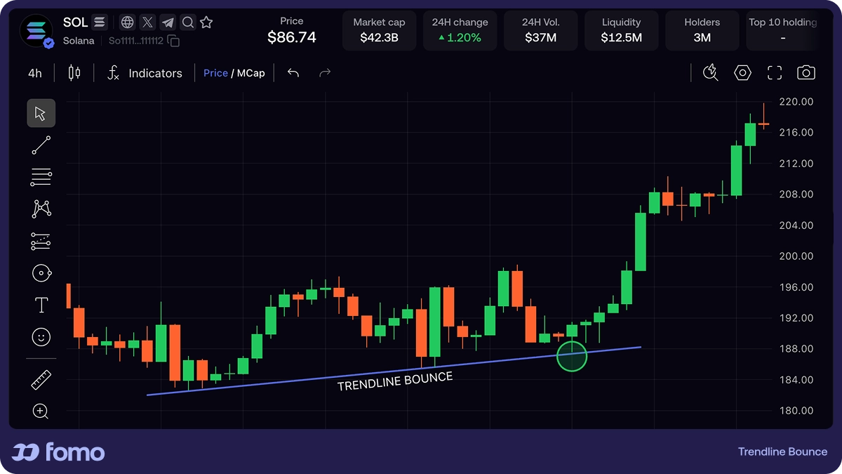
When price approaches a confirmed trendline and bounces off of it, this signals that the trend remains intact. Traders may look to enter in the direction of the trend at or near the trendline, placing their risk-off level just beyond it.
This is a trend-continuation setup: you're joining an existing move after a pullback to a level that has proven meaningful.
Setup 2: The Trendline Breakout
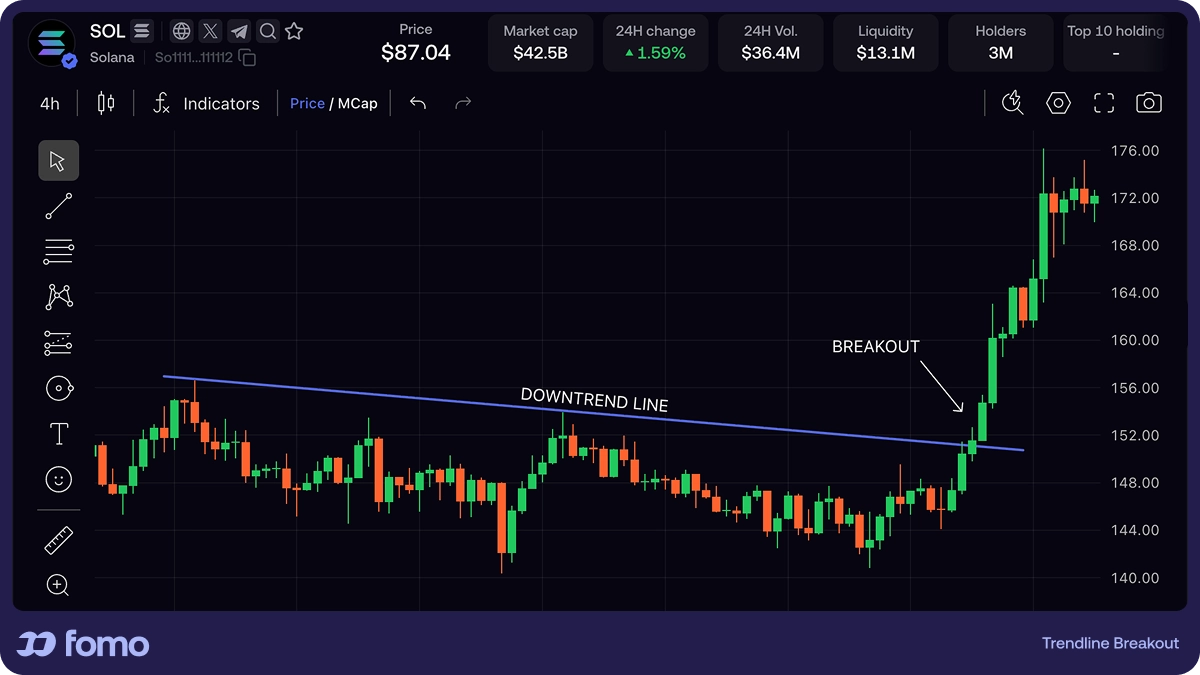
When price decisively closes beyond a trendline — above a downtrend line or below an uptrend line — this may signal that the trend is weakening or reversing. Traders watch for a clean candle close beyond the line, not just a wick poking through.
A common approach is to wait for a retest: after breaking through, price often returns to the old trendline (which may now act as the opposite — former resistance becomes support, or vice versa). This "trendline flip" can offer a higher-confidence entry.
Common Trendline Mistakes
Forcing lines to fit a bias
If you have to ignore multiple candles or twist the angle to make a trendline "work," it isn't valid. Let the market define the line, not the other way around.
Using only one timeframe
A trendline that looks significant on a 5-minute chart may be irrelevant on the daily. Start with higher timeframes and work down.
Treating the line as an exact level
Trendlines are zones, not pixel-perfect boundaries. Price may overshoot slightly before reversing. Allow for some flexibility.
Drawing too many lines
Cluttering a chart with a dozen trendlines creates noise, not clarity. Focus on the one or two most obvious, well-tested lines.
Ignoring changed structure
A trendline that held last month may no longer be relevant if the price structure has shifted. Regularly reassess whether your lines still reflect current price behavior.
Quick Checklist: Is Your Trendline Valid?
- ✅ Connects at least two clear swing points (three is better)
- ✅ Doesn't cut through candle bodies
- ✅ Feels natural — you didn't have to force it
- ✅ Aligns with the visible trend direction
- ✅ Has been tested (price has reacted at the line)
- ✅ Drawn on a meaningful timeframe
Why Trendlines Work
Trendlines work because they reflect the collective behavior of market participants. When enough traders recognize the same level, their buy and sell decisions at that level create a self-reinforcing dynamic. Each bounce adds credibility, which draws more attention, which makes the next bounce more likely — until it eventually doesn't hold.
This is especially visible in crypto markets, where social trading and real-time visibility into what others are buying or selling accelerate this dynamic. On platforms like fomo, you can see other traders' buy and sell actions overlaid directly on a token's price chart. Watching where real money clusters around key levels adds a powerful social layer to traditional chart analysis. When you combine what a trendline tells you with what real traders are actually doing at that level, the signal becomes significantly stronger.
FAQ
What is a trendline in trading?
A trendline is a diagonal line drawn on a price chart that connects two or more swing highs or swing lows. It visually represents the direction and strength of a trend, acting as dynamic support in uptrends and dynamic resistance in downtrends.
How many touches does a trendline need?
You need a minimum of two points to draw a trendline, but three touches are widely considered the threshold for confirmation. Quality matters more than quantity — strong, well-spaced reactions at each touch point are more meaningful than many weak ones.
Should I draw trendlines using wicks or candle bodies?
There's no strict rule. Most traders use wicks but prioritize getting the cleanest line with the most touches. The key principle: the line should not cut through candle bodies. Some overlap with wicks is generally acceptable.
What timeframe is best for drawing trendlines?
Higher timeframes (daily, 4-hour) produce the most reliable trendlines. Start there to identify the major trend, then use lower timeframes for precise entry timing. A trendline visible on multiple timeframes carries more weight.
What does it mean when a trendline breaks?
A trendline break occurs when price closes decisively beyond the line. It may signal that the existing trend is losing momentum or reversing. However, not every break leads to a reversal — always look for confirmation before acting.
How are trendlines different from horizontal support and resistance?
Horizontal support and resistance mark fixed price levels. Trendlines are diagonal and move with price over time, making them dynamic. Both tools identify areas where price is likely to react, but trendlines specifically track the pace and direction of a trend.
Can trendlines be used for crypto trading?
Absolutely. Trendlines apply to any asset with a price chart. They're widely used in crypto, forex, stocks, and commodities. The same principles of connecting swing highs and lows apply regardless of the market.
Key Takeaways
- A trendline connects swing highs or swing lows to visualize trend direction
- Uptrend lines act as support; downtrend lines act as resistance
- Two points draw the line; three points confirm it
- The two primary setups are trendline bounces (continuation) and breakouts (potential reversal)
- Never force a trendline to fit — let the market define it
- Higher timeframes produce more reliable trendlines
- Trendlines are zones, not exact lines — allow for some flexibility
- Combining trendline analysis with social signals (like seeing where real traders are active) strengthens your edge
This article is for educational purposes only and does not constitute financial advice. Trading involves risk, and past performance does not guarantee future results. Always do your own research before making trading decisions.